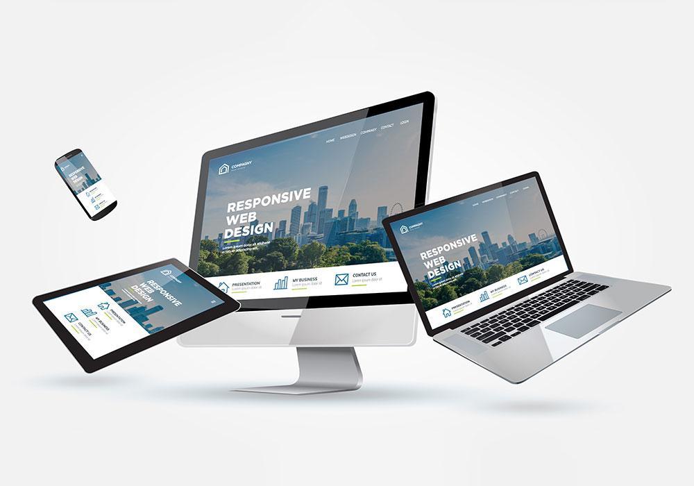
Responsive Web Design is a web design technique whereby the content of the site automatically adapts to the screen size of the device on which it is displayed. This allows you to conveniently browse websites on both the desktop and tablet or smartphone. Nowadays it’s really hard to imagine maintaining a professional brand image online without having a well-optimised, visually attractive and responsive website.
Why should you make sure to have a responsive website?
Currently, over 53% of all Internet users browse the Internet via their smartphones. On the other hand, traffic from desktops is systematically decreasing and currently amounts to only 44%.
As a company that wants to attract customers, you must provide users with the most convenient access to your offer or communication with your brand. The responsiveness of the site provides this convenience by enabling us to use the full potential of all devices that we use on a daily basis. Responsive Web Design allows you to automatically adjust the size of graphics, font sizes and the sizes of individual elements of the page in such a way that not only does it display well on any device, but also maintains the highest possible efficiency and loading rate.
For Google, responsiveness and site loading speed is one of the key factors affecting its visibility in search results. So, if you want to successfully advertise your brand on the web, you should first invest in a well-optimised website.
How to create a responsive website?
Responsive websites are created primarily by adjusting the width of displaying content to the resolution and width of device screens. The design of a responsive website begins with an appropriate graphic design that includes the placement of individual columns and containers relative to the resolution in which the website will be displayed.
Then, based on the layout, the website is coded in HTML and CSS. The CSS style sheet is responsible for the appearance of the website, and the HTML markup language for the core of the website. How will your site change the way its content is displayed depending on the screen dimensions? It all depends on how you code it.
However, a good example showing website content adjustment may be that when, for example, in a desktop resolution of 1080 px a subpage will display a single horizontal row of 6 products, while on a smartphone with a screen width of 300 px, this row will change into 2 columns and 3 position lines. This adjustment of the content arrangement on the page depends on the appropriate HTML commands.
Instead of entering the entire code manually when creating responsive websites, it is worth using the appropriate framework that will facilitate the work with RWD layouts. An example of such a framework can be Twitter Bootstrap, which thanks to modules and classes, makes it easier to adjust pages to devices with different resolutions.
Invest in a modern and fully responsive website.
Are you looking for specialists who can create a modern, aesthetic and functional website that will provide the best UX to your potential clients? Contact Corpixa Studio and get a site that will be the best online showcase of your company.
